During my tenure at the Royal Academy of Art in The Netherlands, my focus extended to delving deeper into type history, type design, and the art of calligraphy.
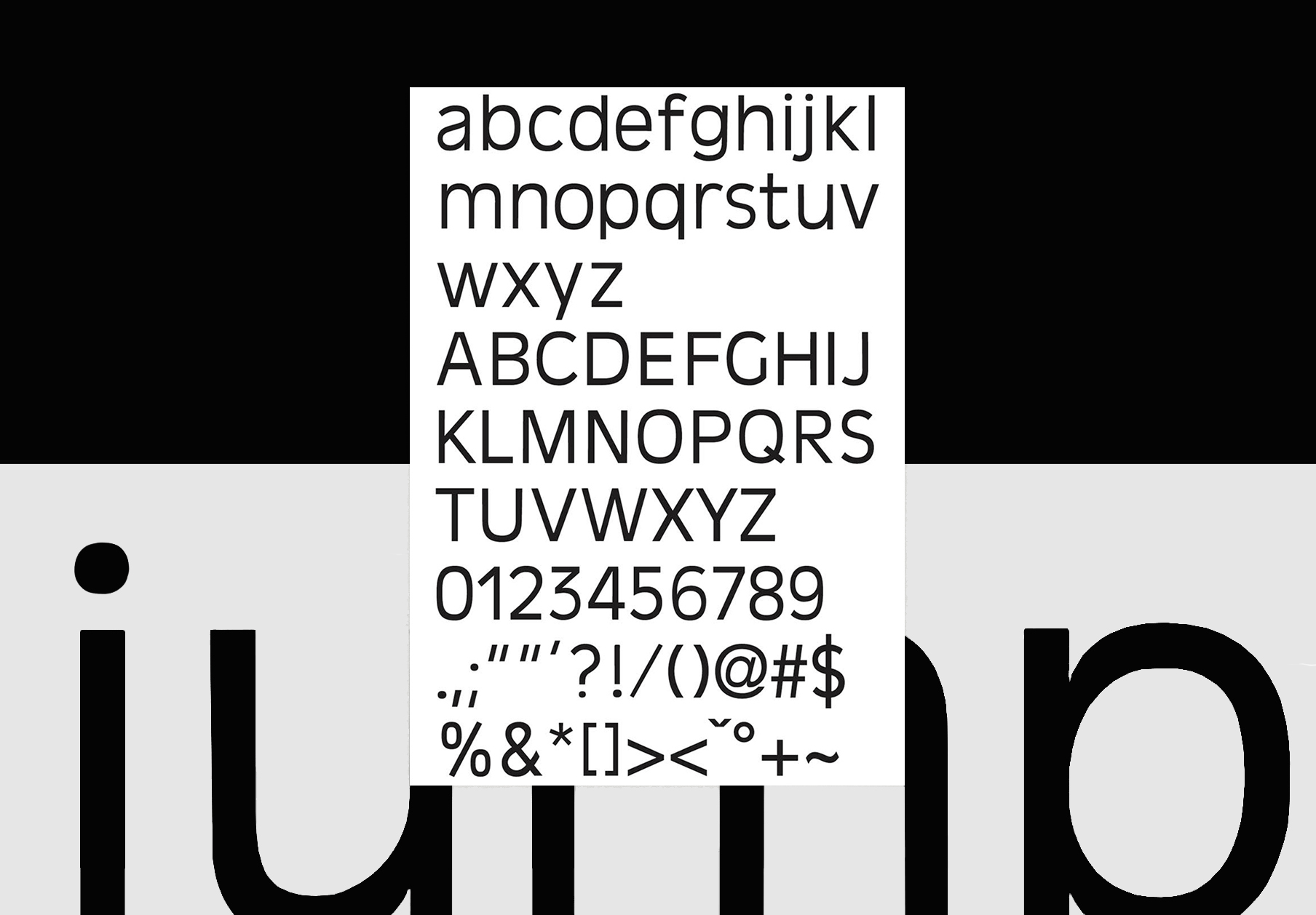
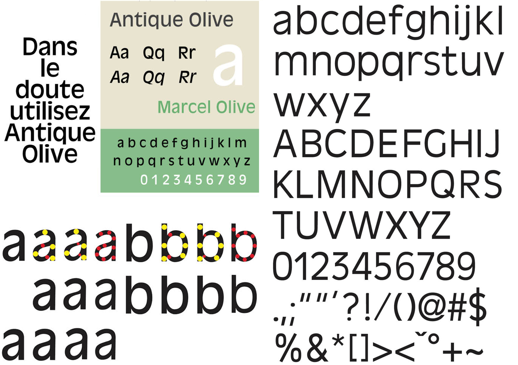
An illustration of this is seen in my reinterpretation of the Antique Olive typeface. Originating in the early 1960s, this typeface, akin to Gill Sans, was conceived by French typographer Roger Excoffon. My approach to redesigning the typeface took a more contemporary and organic route, resulting in diminished contrast and heightened naturalness. I initiated the process by meticulously analyzing the original font, extracting its most robust characteristics, and subsequently experimenting with diverse contrasts and widths to determine the optimal fit for the new design. The resultant typeface found its way into the Parsing Digital book created in collaboration with Sally Golding for the Austrian Cultural Forum.
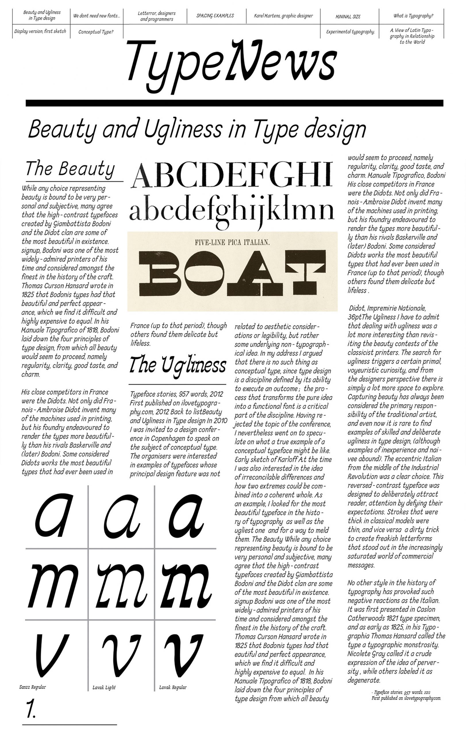
Lavak/Left Handed embodies my response to the challenges faced by a left-handed individual passionate about calligraphy. Traditionally, calligraphic techniques have predominantly catered to right-handed individuals, prompting me to devise my own set of rules. A further iteration of this concept materialized as the Sanzz font – a modern adaptation. In its transformation from a serif to a sans serif typeface, the central objective was to retain certain shared elements between the two fonts.
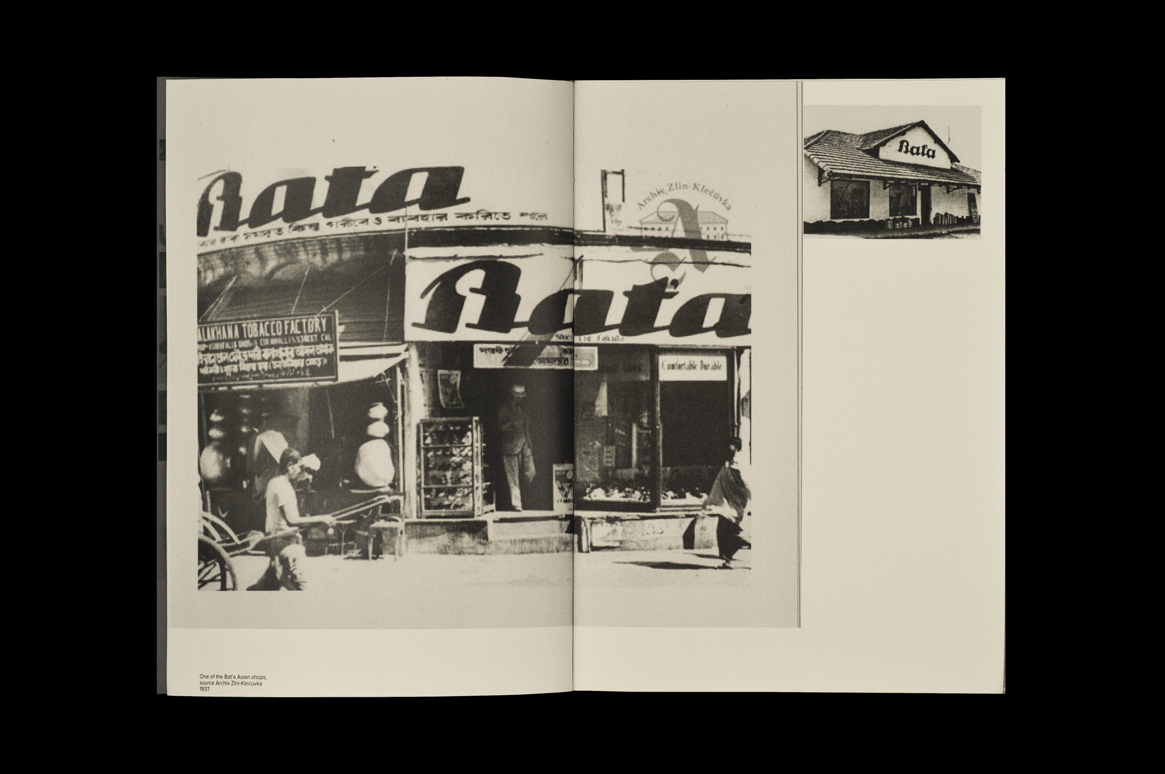
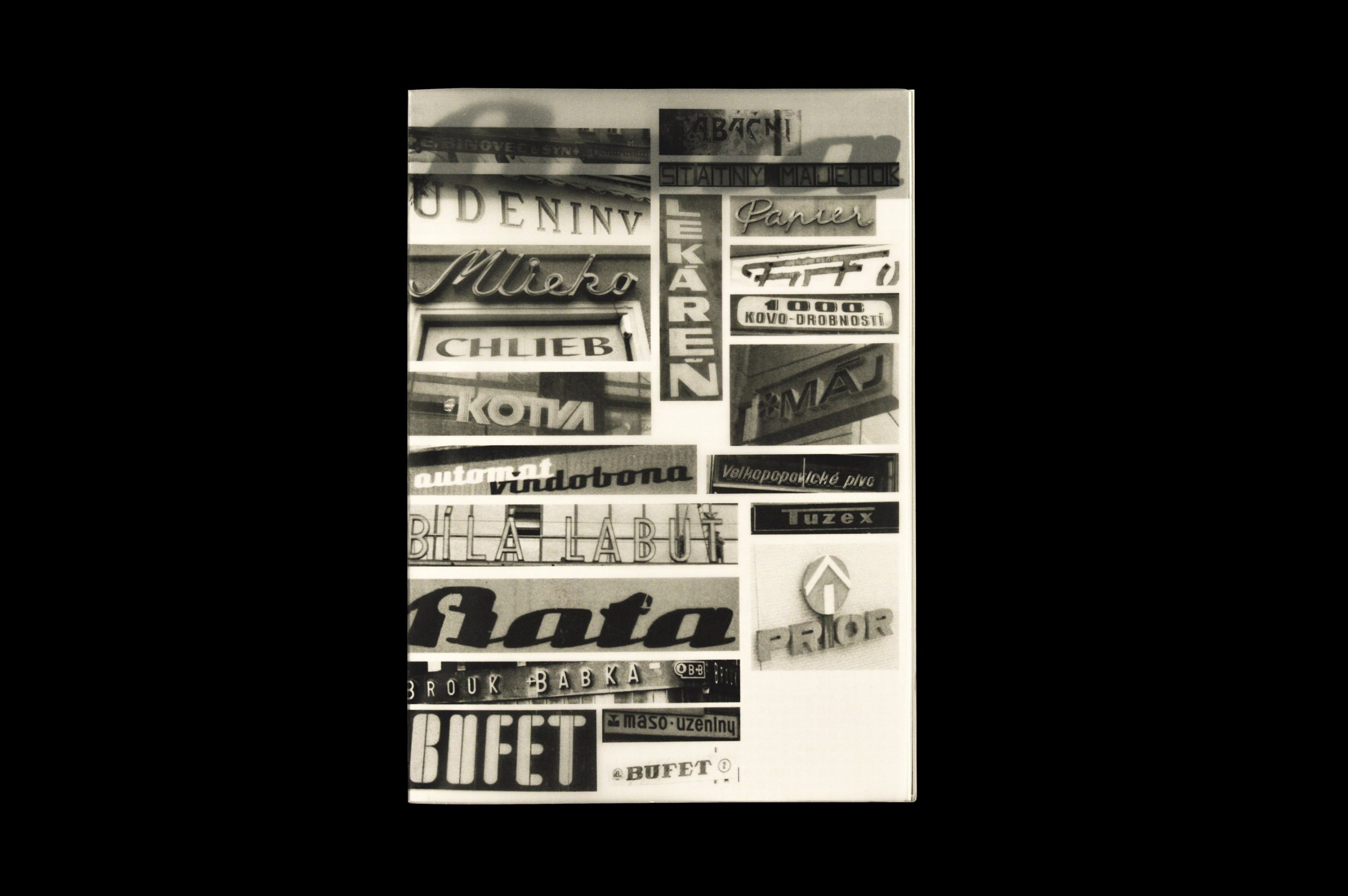
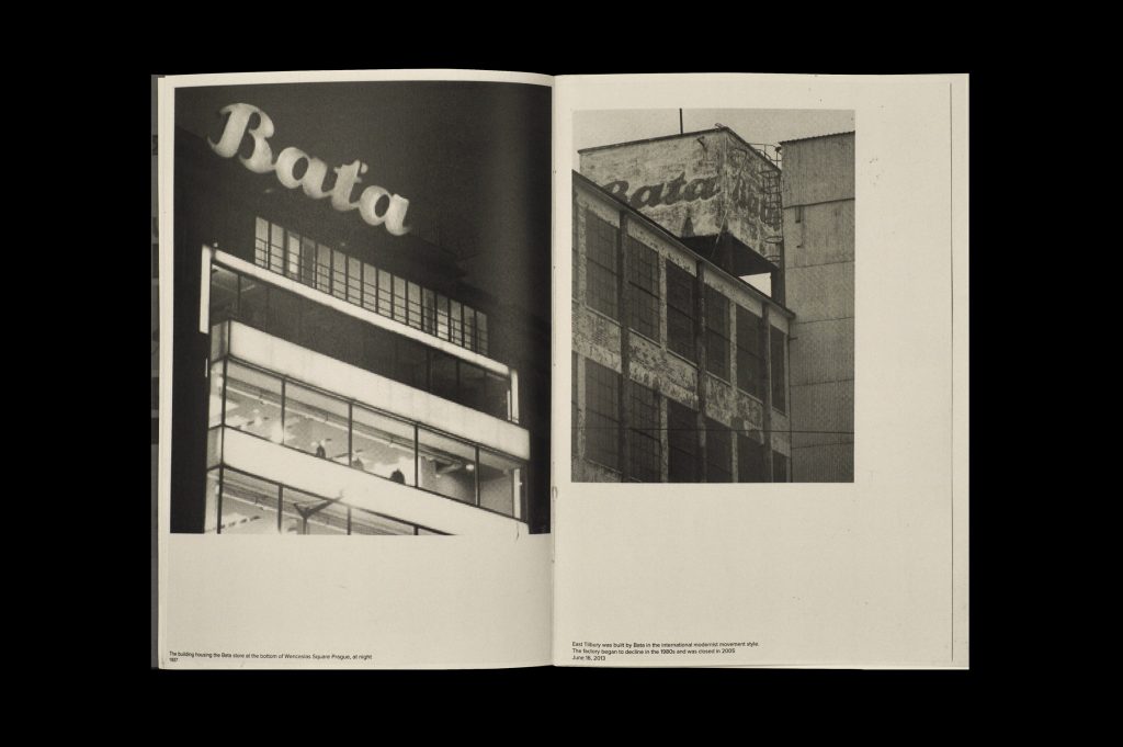
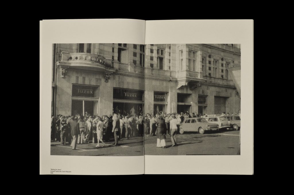
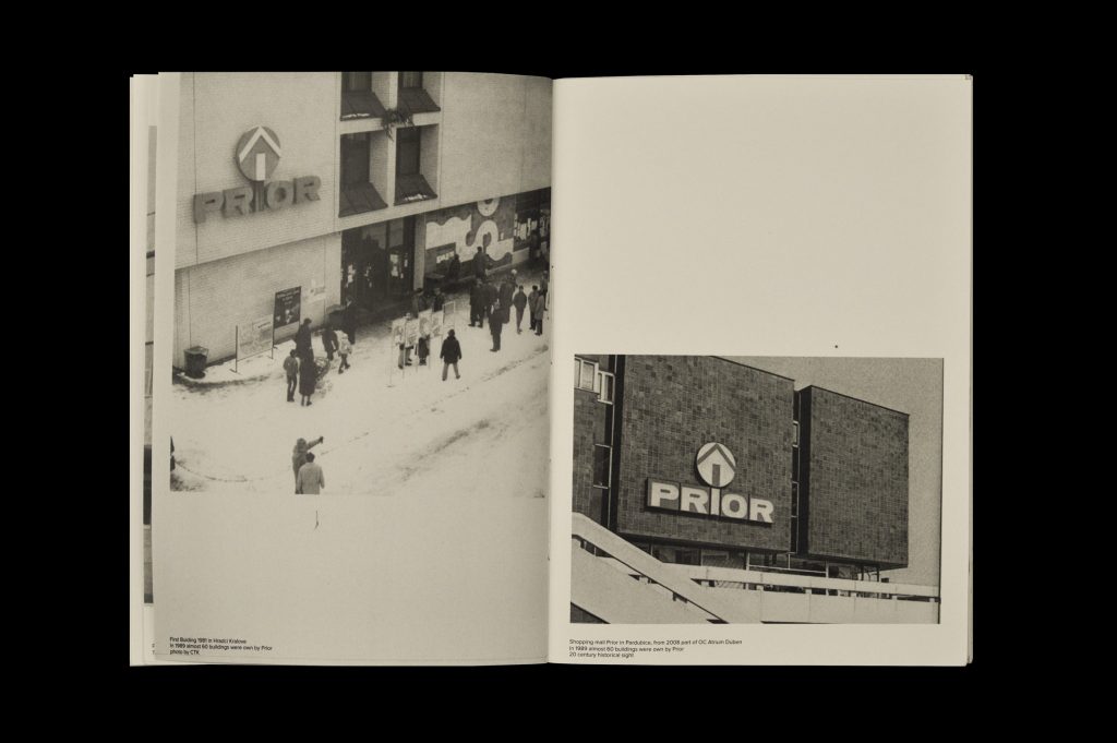
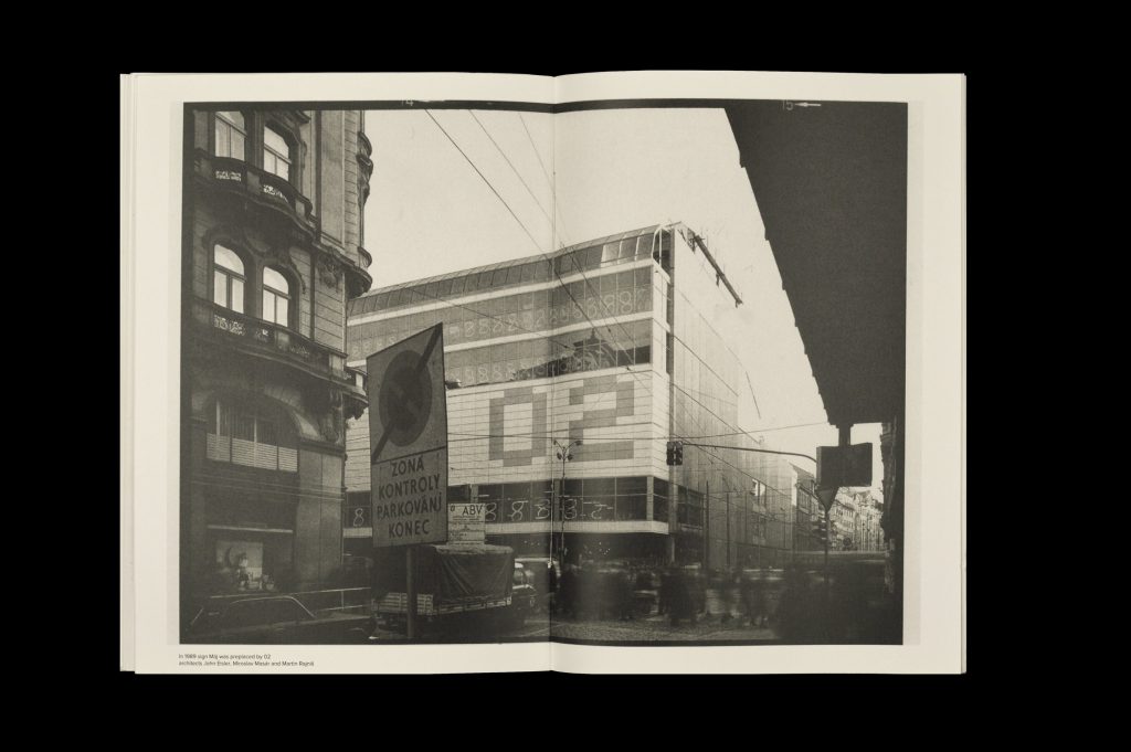
The Evolution of Signs stands as a publication delving into the historical context of Czecho-Slovak brand logos. My investigation focused on the logos of prominent retail establishments, enabling me to chart the trajectory of various major and minor shops. This exploration shed light on the evolution of typography, observing how it transitioned from bespoke and distinctive craftsmanship to ushering in a trend of uniform sans serif styles across multiple shops or, in some instances, faded into obscurity amid the urban landscape.